Brief
AXLR is a technology transfer acceleration company: it acts as an intermediary between research laboratories and companies by supporting and financing the various phases of project development.
There are 4 phases in the creation process: defining the need, the R&D program, intellectual property management and commercialization of the new technology. All these phases are not mandatory, and can be applied to start-ups, SMEs or large corporations.
We collaborated with APE Edition to simplify the discourse while reinforcing AXLR’s brand image: the main challenge was to relate everyone’s needs with the different stages while remaining simple and readable.

Concept
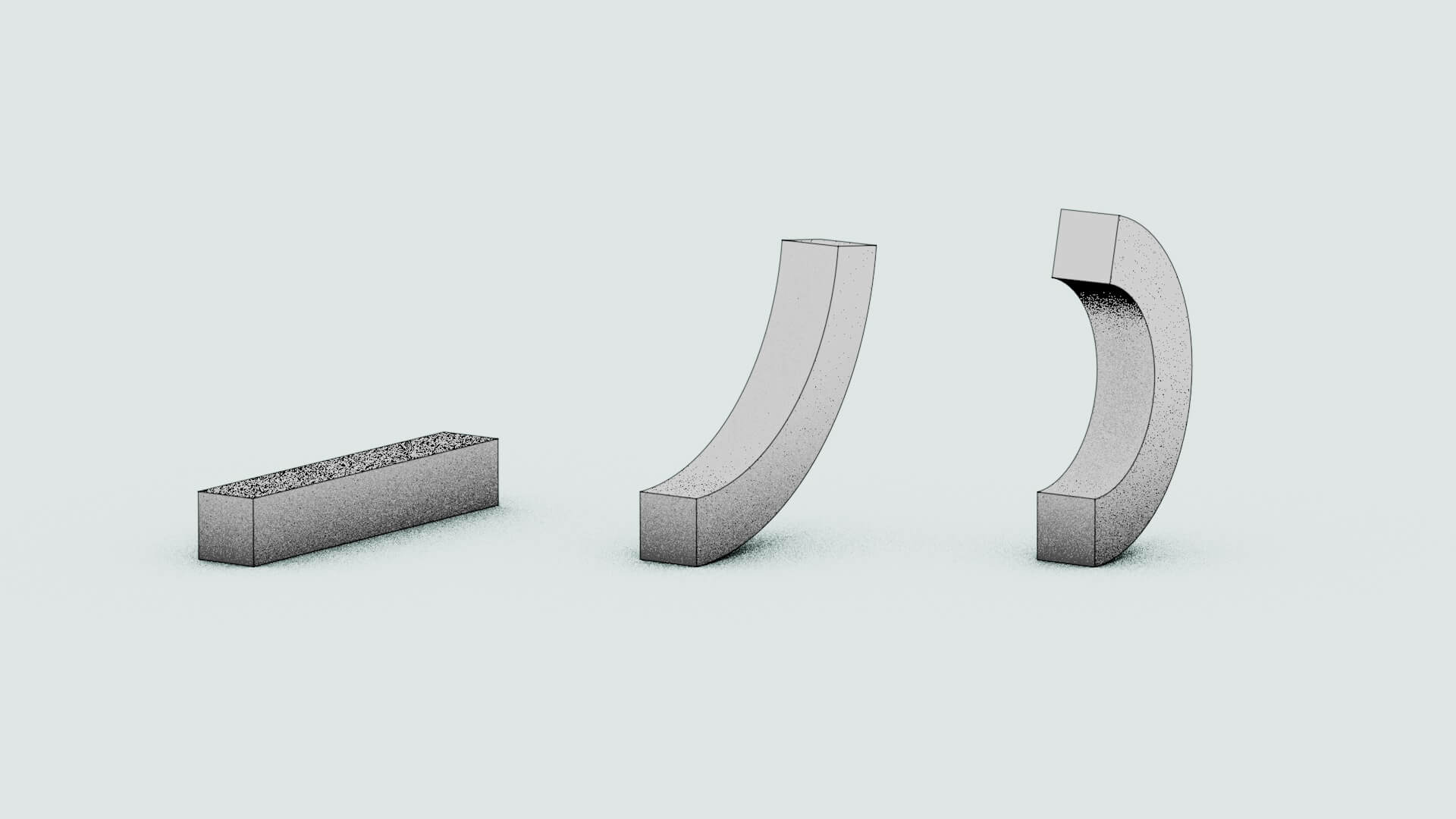
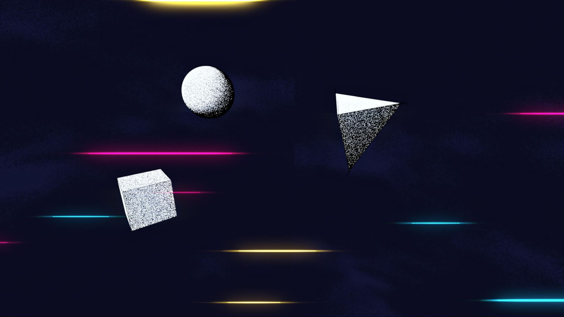
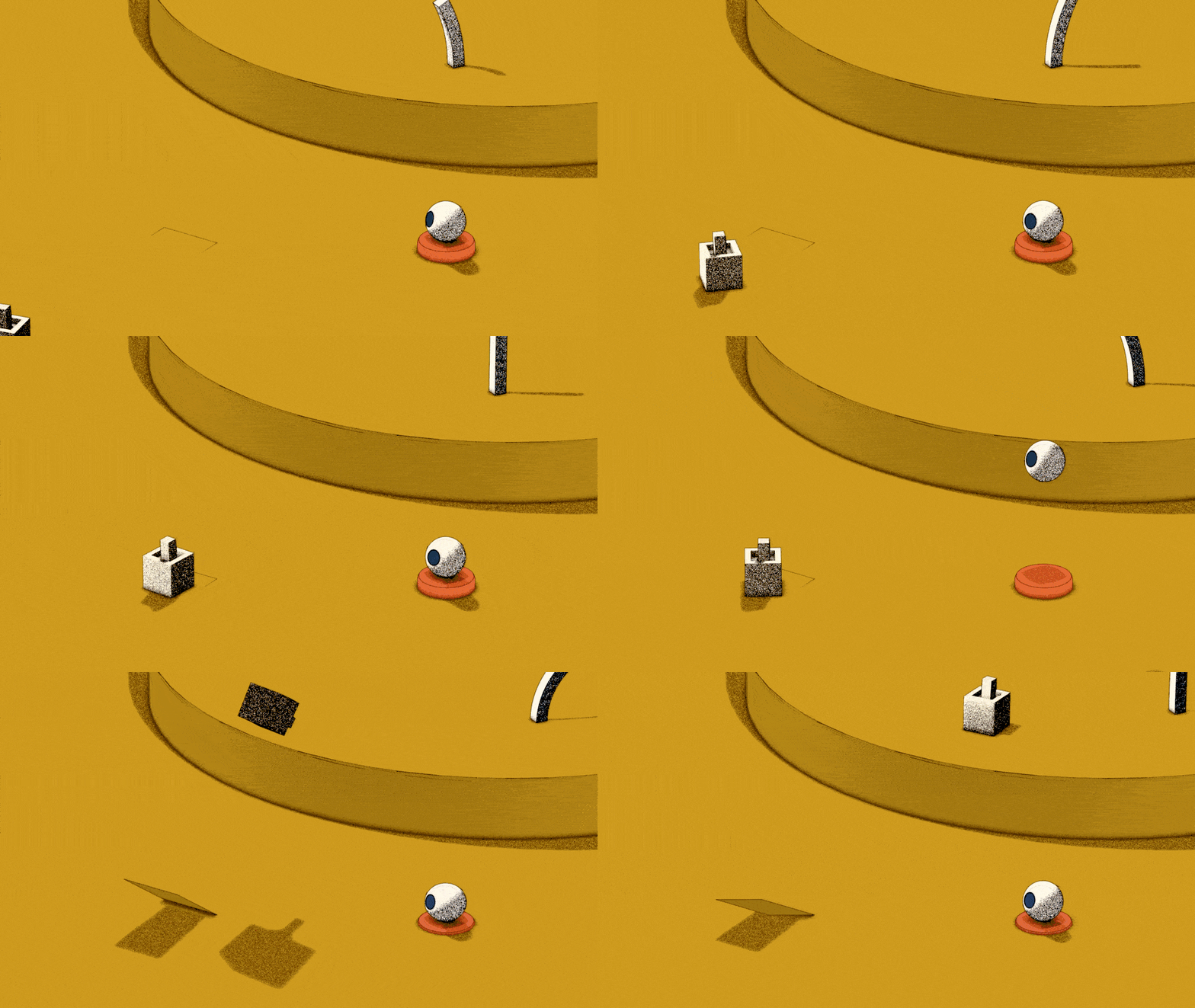
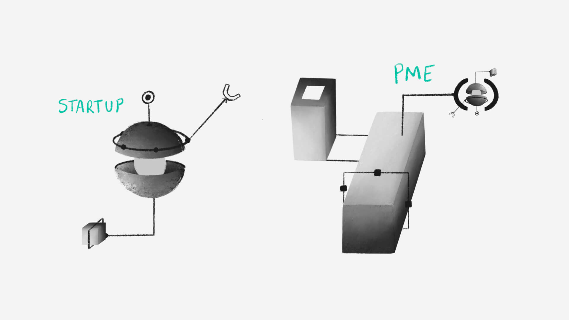
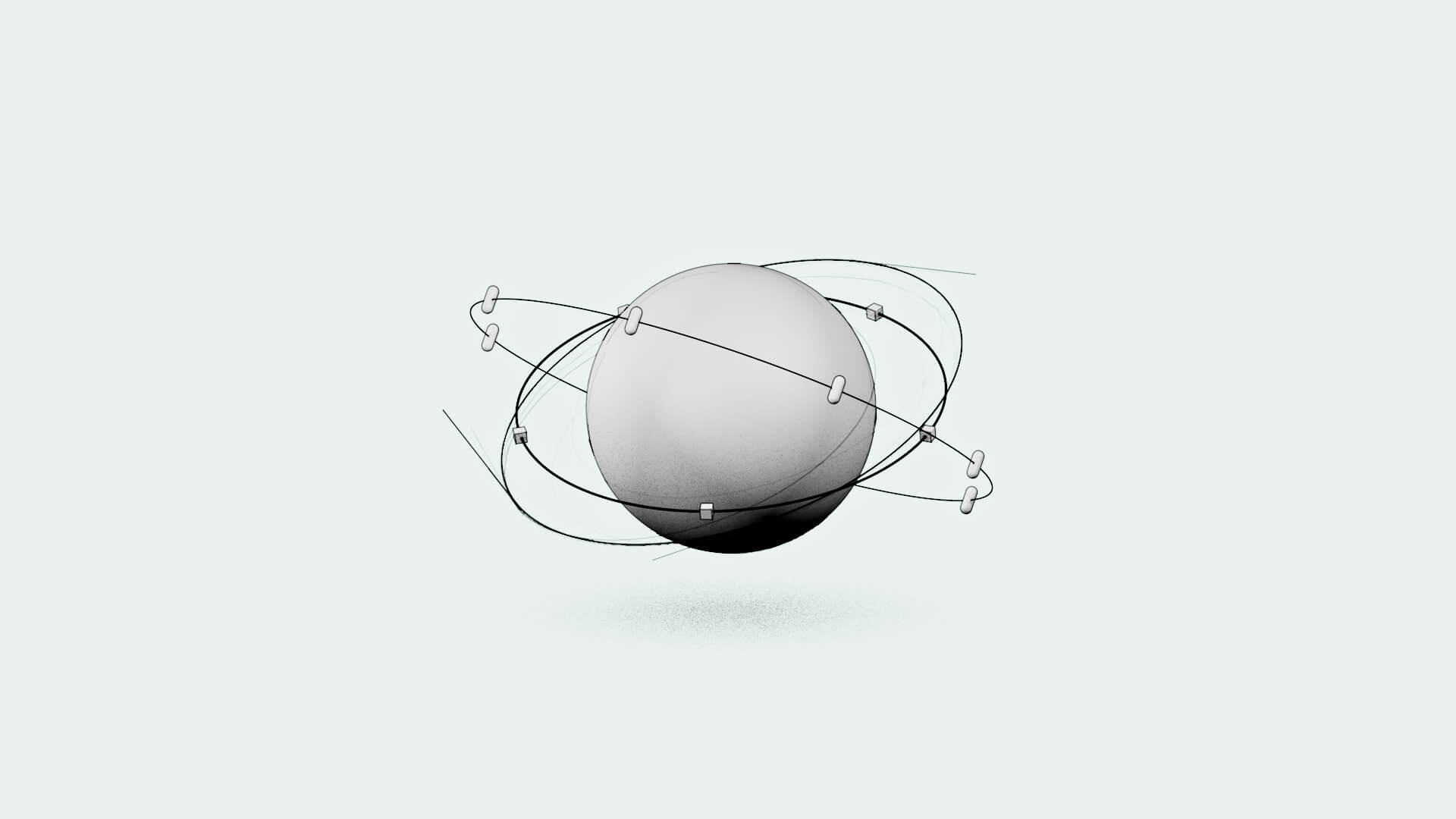
Defining companies visually is complicated, especially when you want to address a multitude of them, all of which operate in totally different ways. So we started with a variety of geometric shapes, which are gradually updated as the film progresses. Start-ups, for example, begin with a single innovation. SMEs or large groups may be in the same situation, or may already have several innovations, branches, etc.
As a result, an innovation can either define the company on its own, or fit in with an existing one. The geometric shapes will evolve as the film progresses, reflecting the different stages in the project’s development.
Artistic direction
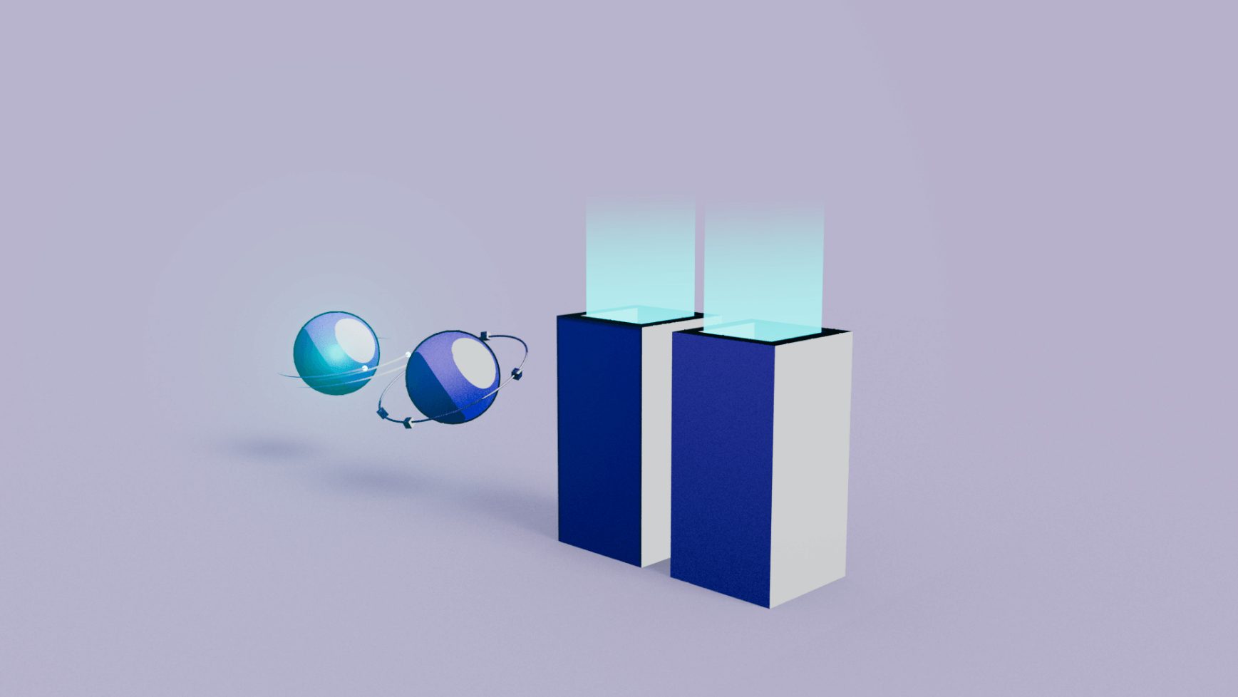
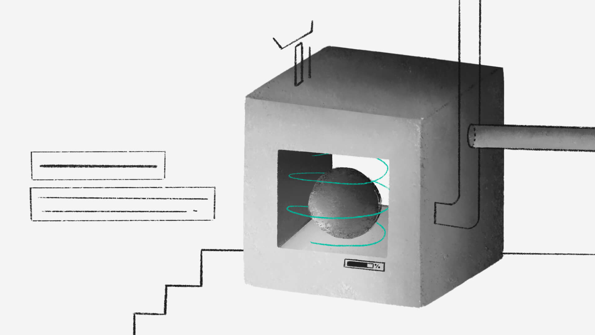
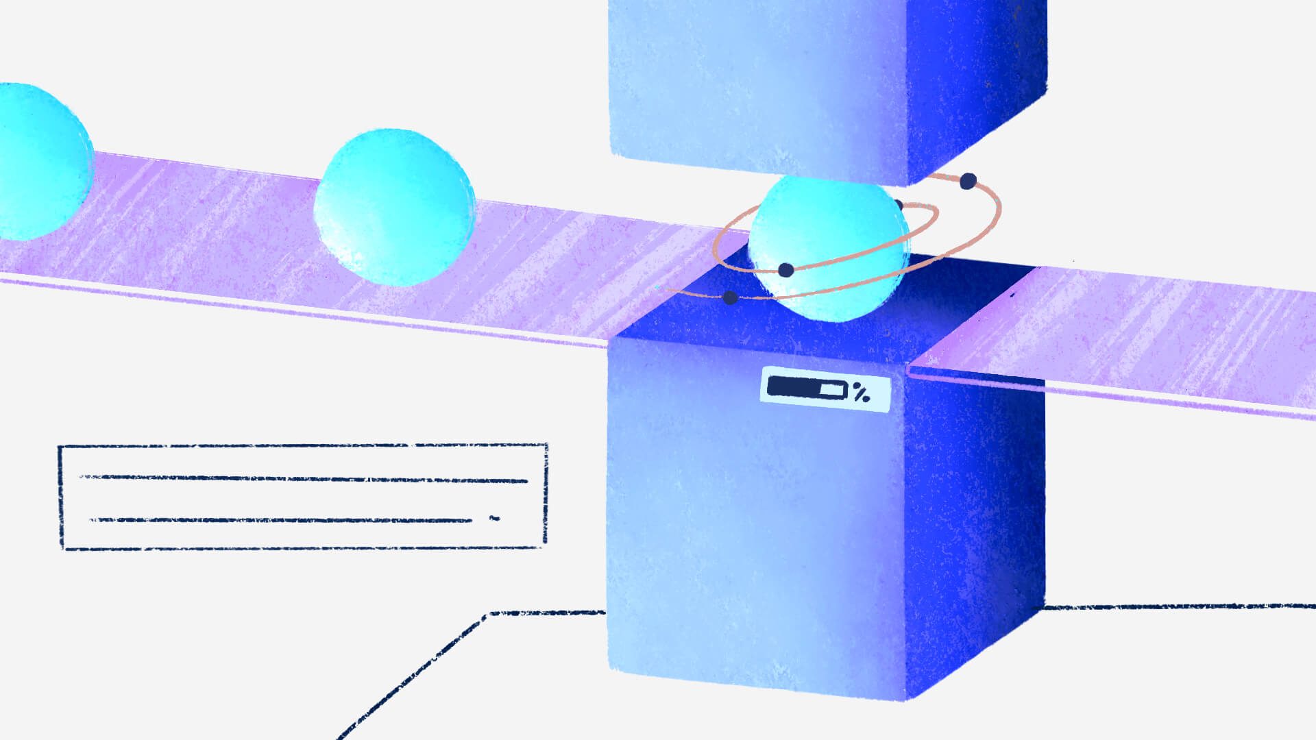
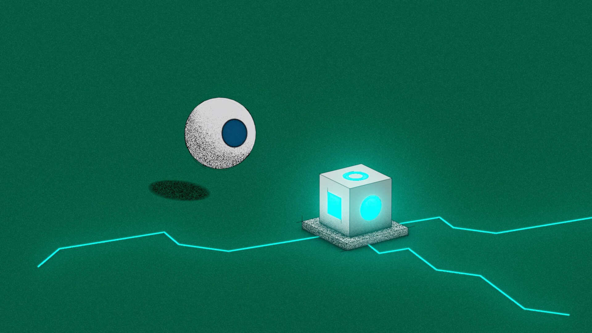
During the graphic research phase, 2 ambiances emerged. The first had a very “new technology” approach, with glow and smooth gradients. The second approach was more graphic, with grain and texture, to bring a more authentic feel, which is sometimes sorely lacking in administrative-based companies: we forget that behind the store, human beings are making decisions.
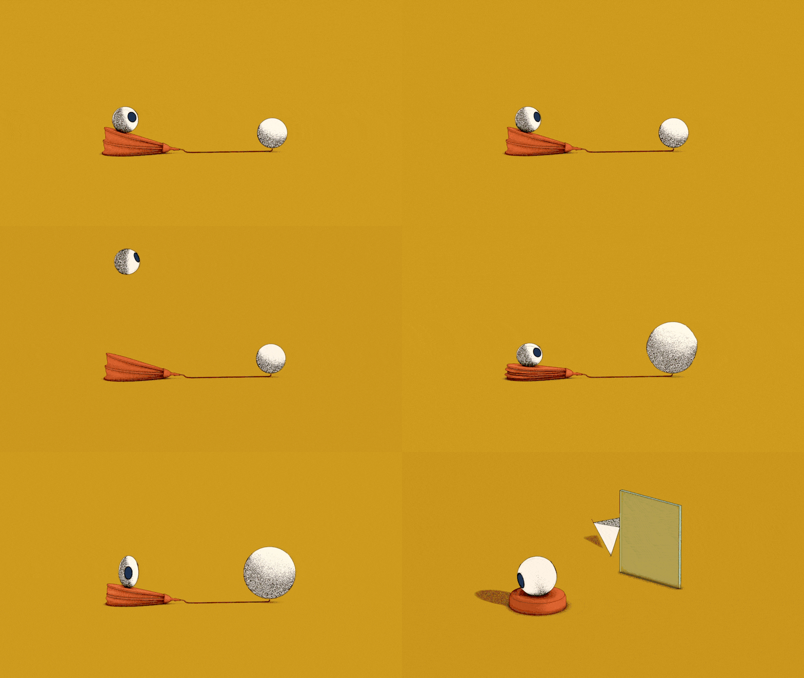
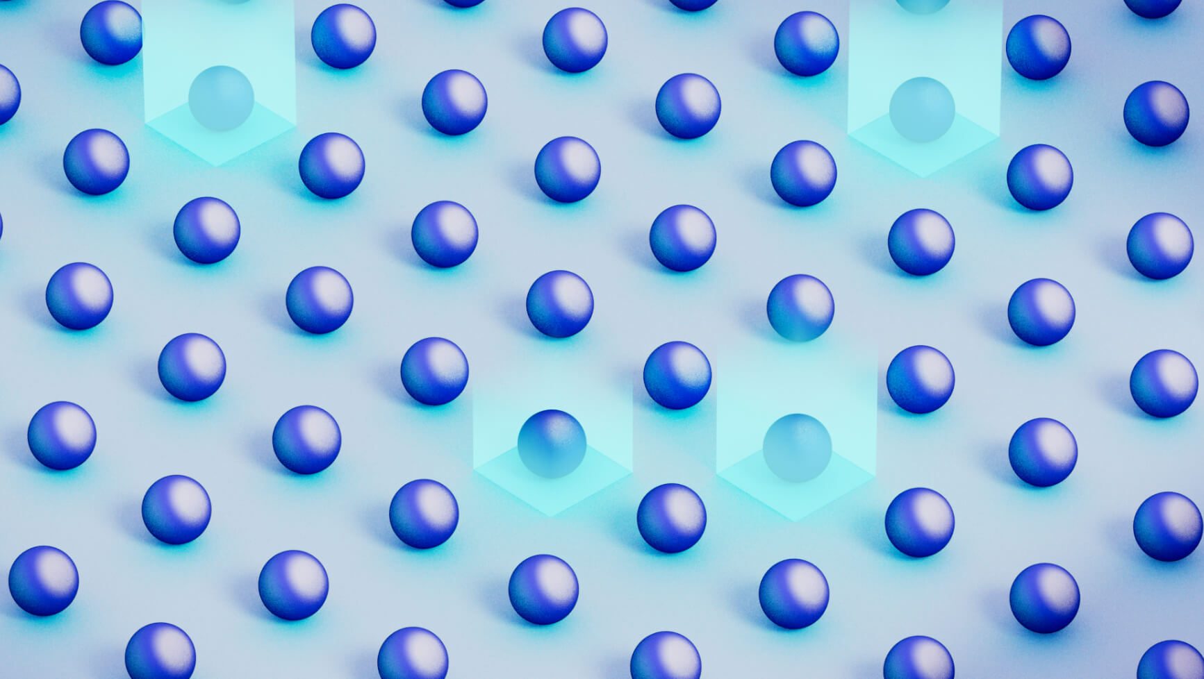
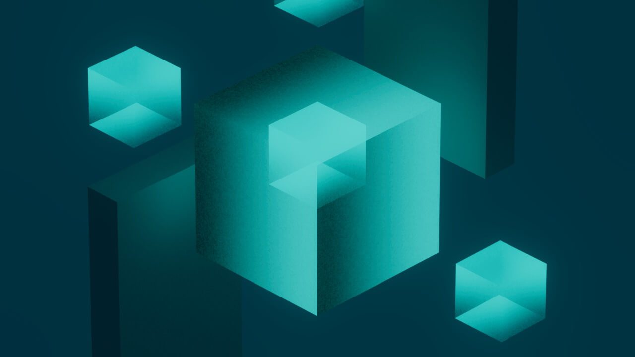
We opted for the second approach. We divided the film into 4 sequences of different colors to visualize the 4 steps of project maturation and reflect AXLR’s guidelines.
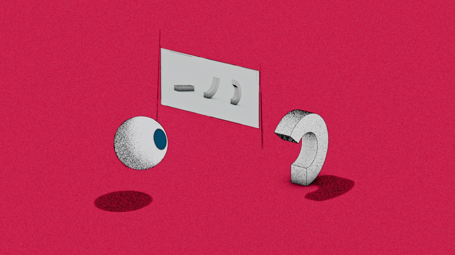
Production
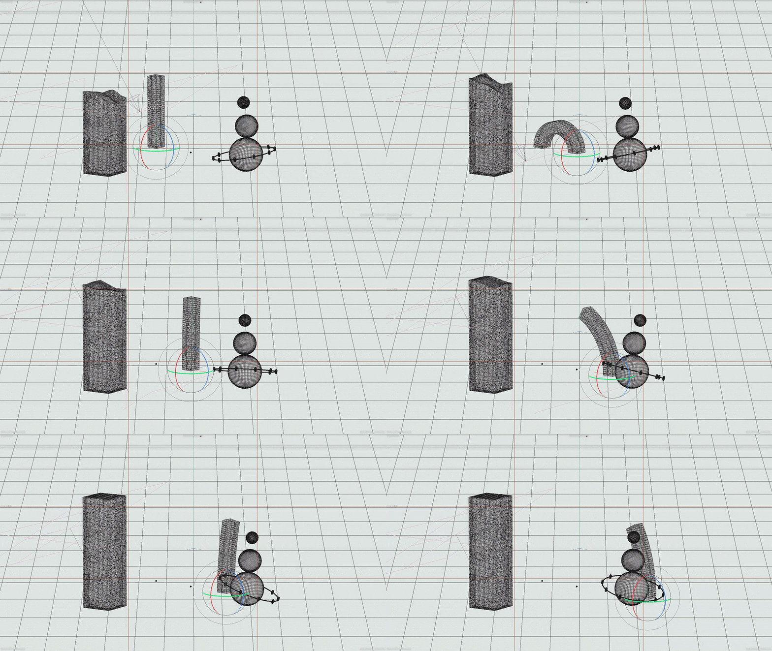
We opted for Cinema4D with Sketch and Toon. This engine is perfect for achieving organic rendering without having to go through frame-by-frame animation, but it also makes it easier to work with depth and to have better control over grain and texture effects.
Nothing being perfect, we wanted to keep the glow to avoid having images that were too dense, which isn’t necessarily compatible with the render engine. We were able to do this in post-prod by working in layers on Fusion.
Conclusion
The project was challenging in terms of writing and graphic design, firstly from a technical perspective, with the learning of new tools and a workflow developed for the project. Then, during the design phase, we wanted to achieve a fine balance between humor, casualness and seriousness. A mix that everyone involved in the production managed wonderfully well, with a very interesting research phase.
