Brief
In the food sector, whether in industry, distribution or catering, rigorous standards are in place, with frequent sanity checks. Zest HACCP is an application for monitoring and simplifying a sanitary control plan using digital tools.
The idea is to create a concise motion design explaining the benefits to the various professionals involved. An additional constraint is that the application is currently undergoing graphic redesign, which means that the video must work with the various versions of the software.

Concept
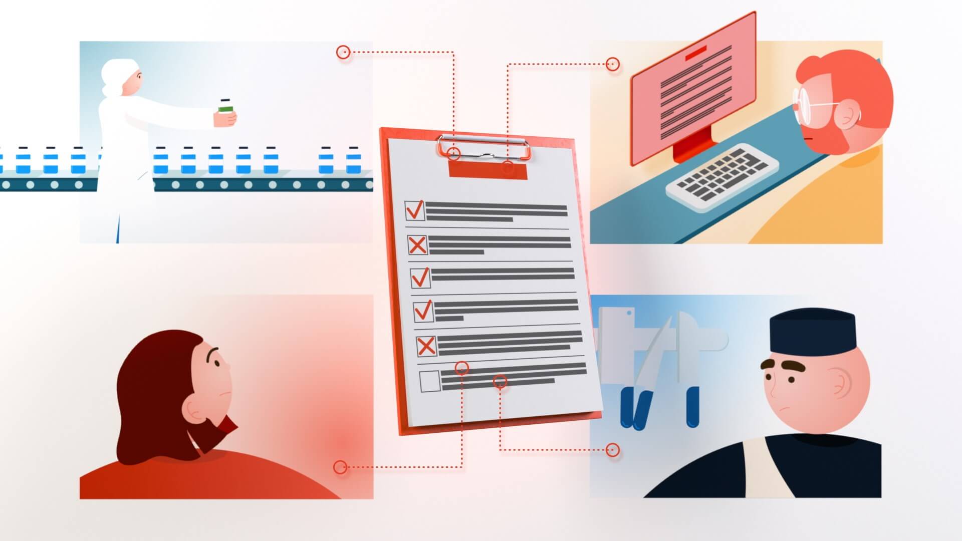
Most retailers are still recording everything on paper. Digitalizing data means no loss or damage during an inspection, better team follow-up via scheduled reminders and instant data transmission, and also a bit more eco-friendly.
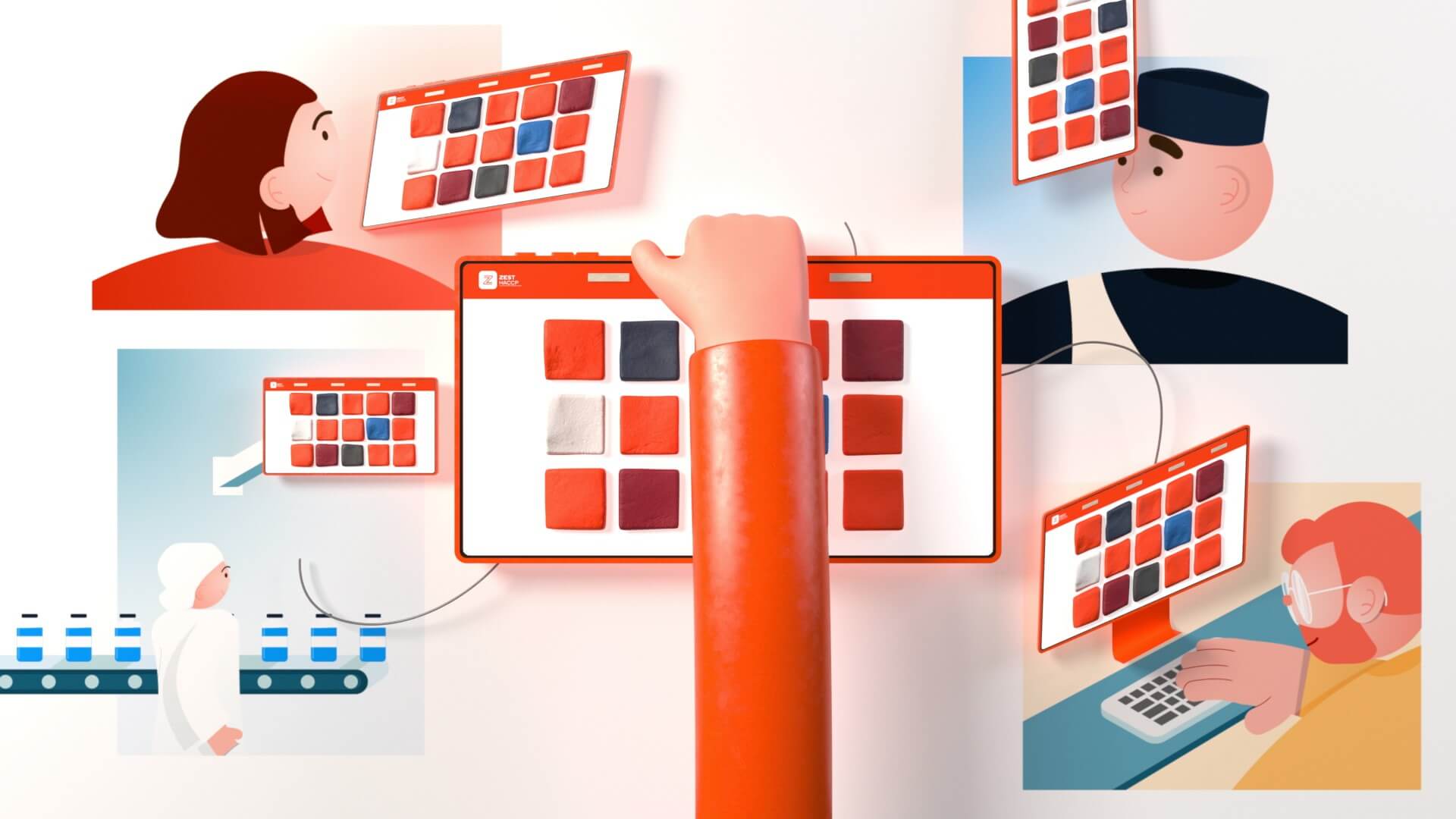
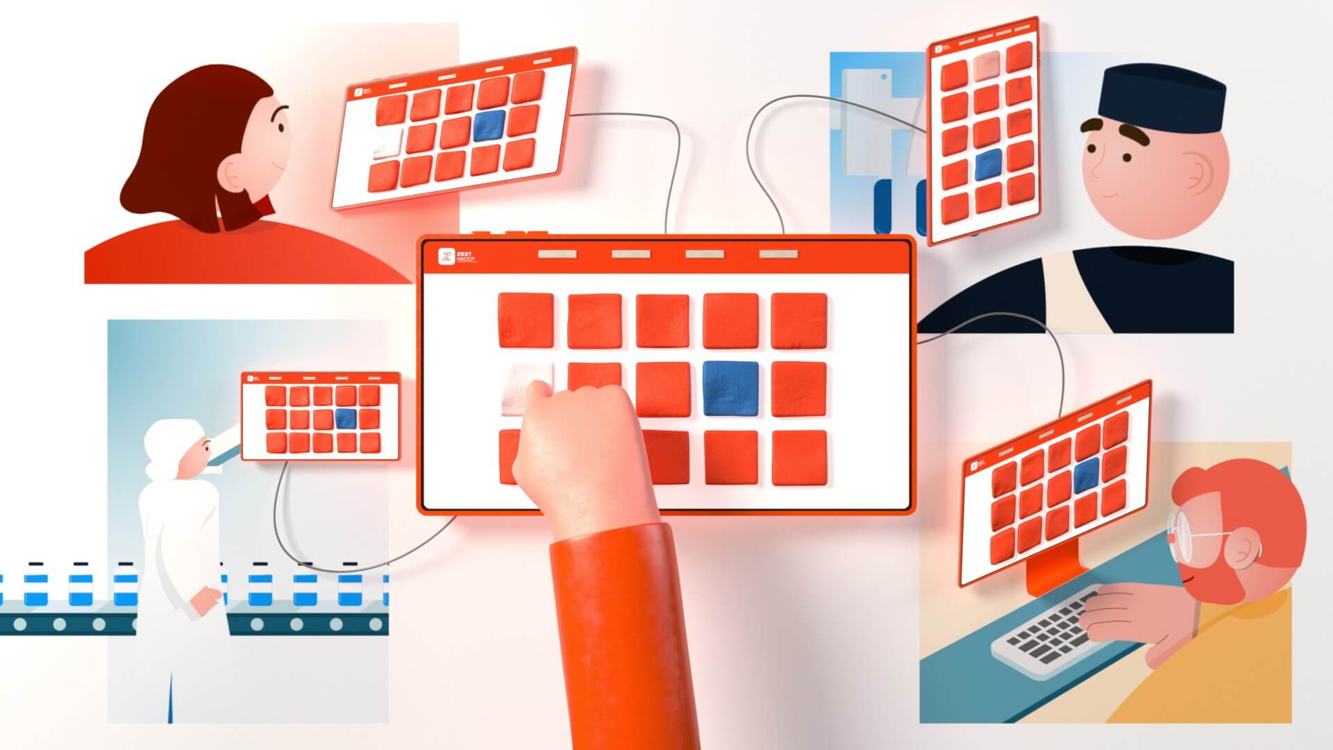
So I decided to show the before and after. Not in the way of TV shopping, of course, but with a graphic bias: everything related to the old methods is in 2D, and the innovation brought by Zest is produced in 3D.
In addition to having a solid and comprehensible concept, this provides an interesting artistic direction.
Artistic direction
We had already produced a series of videos for Zest HACCP, explaining how to use the application with the current interface. For the setting, we opted for delicate, pastel-colored backgrounds and characters without really defined faces. The background is there to set the scene, without taking precedence over the application.
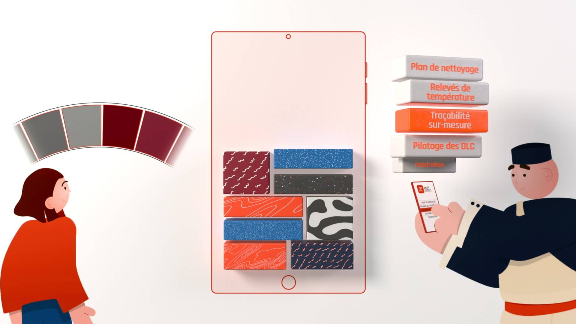
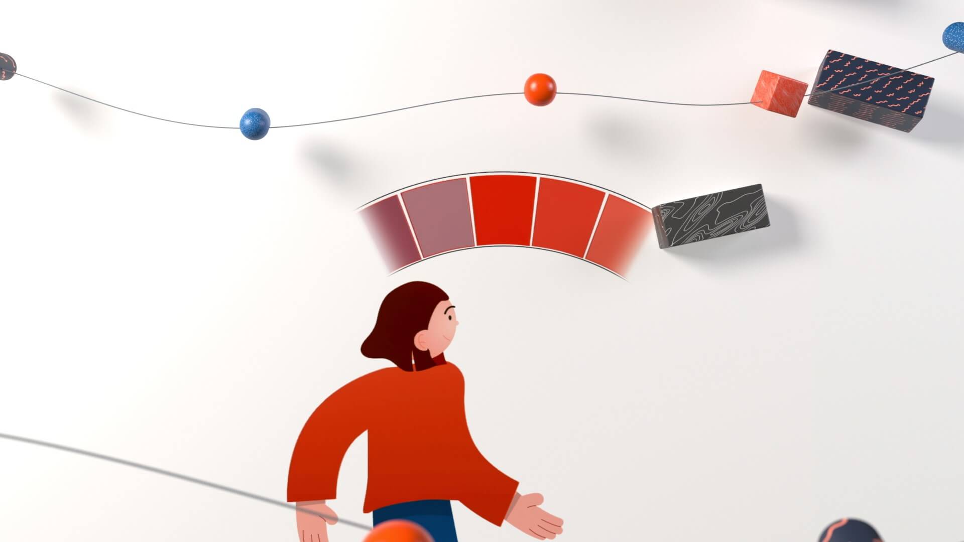
Here, it’s just the opposite. As it’s about building a brand image, I had to bring out the colors of the ZEST brand, which are very saturated. To emphasize the benefits of the application without showing it, it was important to focus on characters and other elements reminding us of the rigorous health safety standards.
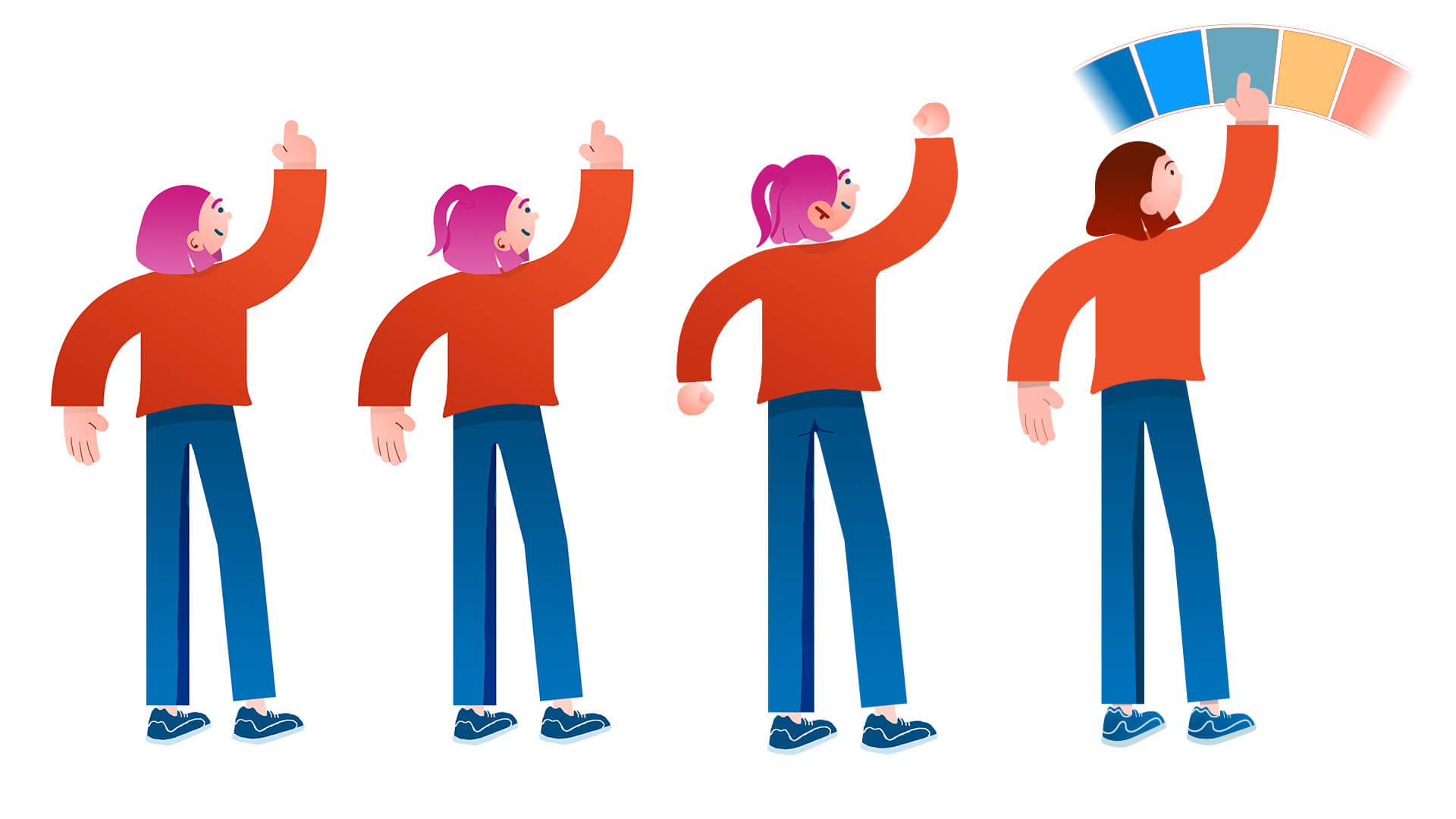

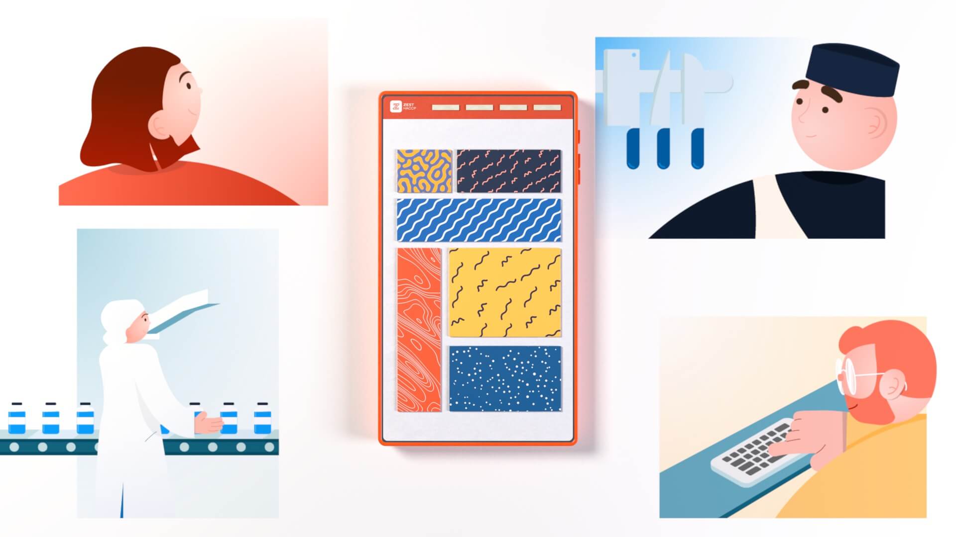
In the end, it’s a very colorful, pop and rich universe, to bring a breath of fresh air to the sanitary control environment.
A note on the design: to avoid too much dissonance between 2D and 3D, I opted for very simple shapes, and a fairly round character design with no superfluous details, to concentrate on their expressions.
Production
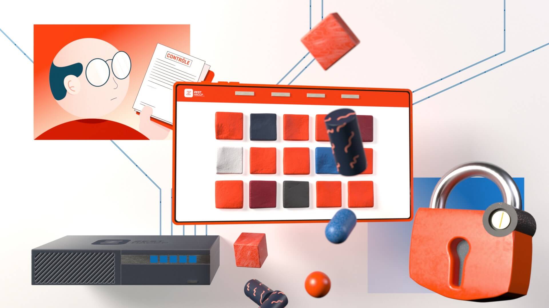
When you decide to mix 2D and 3D, the retakes can be very complex. A single 2D source and a single 3D source were therefore needed to facilitate the construction of the timing between the different parts.
On the 2D side, to facilitate animation, I used the Rubberhose script. But for the precision of facial emotions, head turning and other rig features, I used Duik Angela.
In 3D, I experimented for the first time with the animation of a hand. The process was galvanizing, and I loved being able to express emotions with precision using just a hand. It also allowed me to create transitions such as the spinning of the tablet, which creates a particularly interesting dynamic.
Conclusion
After the 36 days of type challenge, I focused my research on mixing techniques, without forgetting the concept and purpose of the video. With Zest, I had the opportunity to fully realize this creative gesture. And none of this would have been possible without the support of Thomas from Phytocontrol, whom I’d like to thank for trusting me and supporting this project.
